It appears the Reverse Retro jersey program is returning to the National Hockey League for the 2022–23 season.
According to multiple reports, Adidas and the NHL will collaborate for a second version of the Reverse Retro line to debut in 2022–23, this time including a throwback sweater for the brand-new Seattle Kraken.
The popular league-wide uniform line made its debut in the pandemic-shortened 2020–21 campaign, with each of the 31 teams then in the league unveiling special alternate uniforms based on designs from the past — but with a twist.
The Colorado Avalanche introduced an altered version of the Quebec Nordiques’ classic white uniform that swapped the Nords’ trademark bright red for the Avs’ maroon. The Arizona Coyotes brought back their old third jersey design from the early 2000s but changed the base color from dark green to vivid purple.
Both the Coyotes’ and the Avs’ Reverse Retro uniforms garnered widespread praise from onlookers, as did many more jerseys from the line. In particular, the Minnesota Wild, Calgary Flames, Los Angeles Kings, Washington Capitals, New York Rangers, and Florida Panthers checked all the boxes with the iconic retro logos and cool colors on their uniforms.
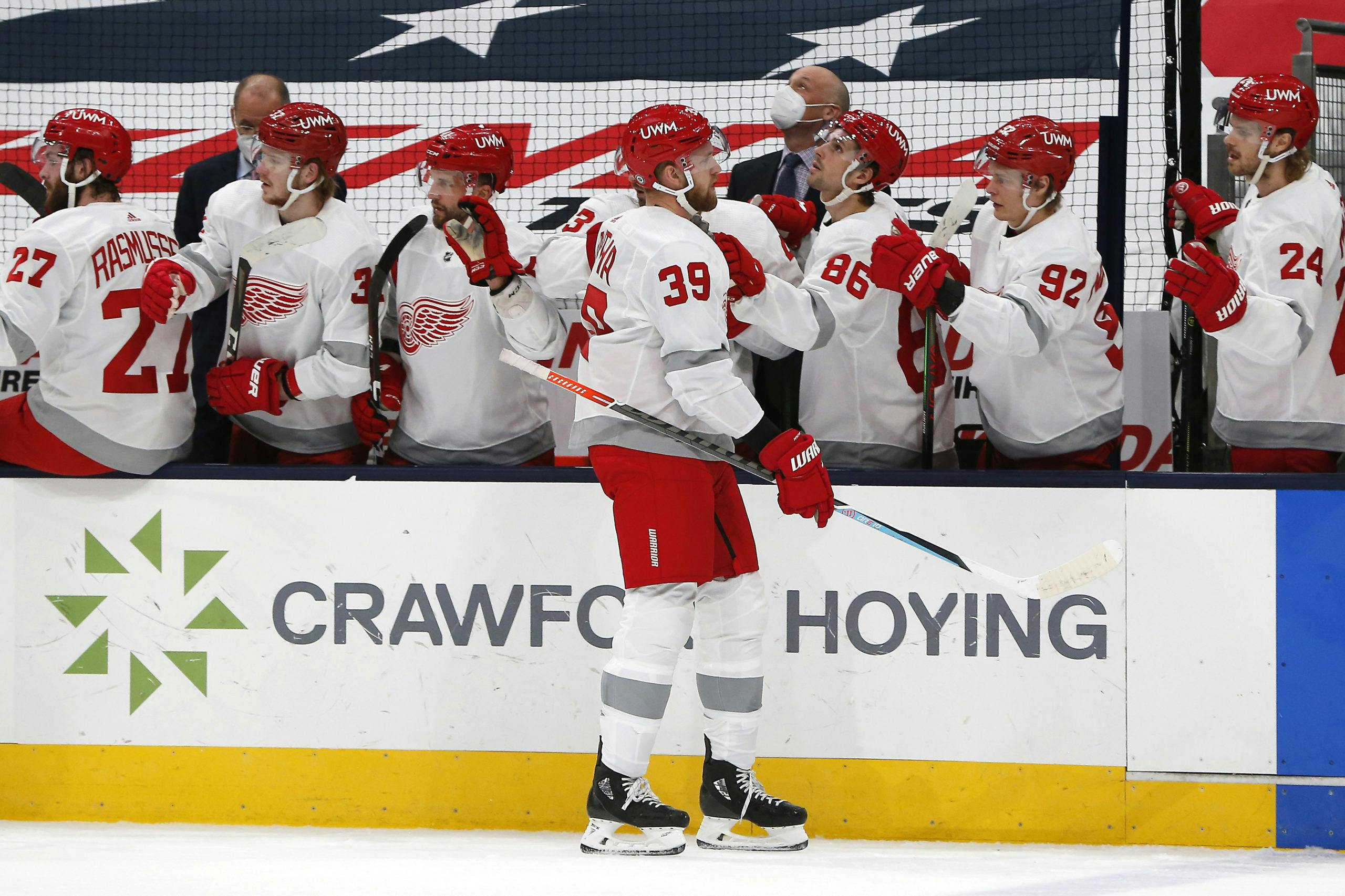
Conversely, the Detroit Red Wings’ Reverse Retro kit received almost exclusively negative reviews. Some fans described them as glorified practice jerseys. One compared them to an “incomplete homework assignment.” A common refrain likened the silver stripes on the arms, waist, and socks to duct tape.
#ReverseRetro night. #LGRW pic.twitter.com/3Vlb1efHeH
— Detroit Red Wings (@DetroitRedWings) March 3, 2021
Let’s try and take a look at the bright side for a moment. For one, the classic winged wheel logo is still there in all its glory. Two, the red helmets, gloves, pants, and lettering contrast with the otherwise white and silver uniform in a really distinct way. It’s rare to see an NHL team wear dark helmets with a white uniform and, in this case, it worked.
But … the “silver” accents absolutely do look like duct tape. Instead of being made out of sparkly silver fabric, as is featured on the Los Angeles Kings’ current alternate uniforms, the stripes on the Red Wings’ Reverse Retro bore a matte finish that looked more like a dull grey both in photos and on the ice. The jerseys also would have benefitted from more red accents.
According to NHL.com, Detroit’s Reverse Retro jersey was “inspired by the jerseys worn when the Red Wings won their ninth Stanley Cup Championship and the Centennial Classic jerseys.” The Wings won their ninth Stanley Cup in 1998 while wearing uniforms basically identical to the ones they use today; the Centennial Classic took place in 2017. That’s hardly “retro.”
Regardless of whether you liked or disliked the Red Wings’ 2021 Reverse Retro jersey, you have to admit they missed out on incorporating some of the more interesting design elements put into use over the franchise’s 96-year history.
While it may seem as though the Red Wings have always worn the same jerseys, there’s actually been quite a bit of variety over the years — you just have to go back far enough. Let’s take a look at three different uniforms the Red Wings could return to (and potentially tinker with) for their new “Reverse Retro” look in 2022–23.
All jersey graphics have been reproduced from the Unofficial NHL Uniform Database.
1927–28 Detroit Cougars / 1991–92 Detroit Red Wings
Artist’s rendering of the 1991–92 Detroit Red Wings throwback jerseys.
The National Hockey League celebrated its 75th anniversary back in the 1991–92 season. As part of the festivities, the league invited its “Original Six” teams — Boston, Detroit, Chicago, Montreal, Toronto, and the New York Rangers — to wear throwback uniforms on special occasions during the milestone year.
The Red Wings elected to draw inspiration from their inaugural years in the league. The franchise entered the NHL in 1926 under the “Detroit Cougars” moniker, which it retained until the 1930–31 season (the “Red Wings” would not be born until 1932–33, at which time they also introduced their now-iconic “winged wheel” logo).
The Cougars frequently changed uniforms during their brief tenure in the NHL. The 1991–92 Red Wings repurposed the look worn by the 1927–28 Cougars, which featured five horizontal stripes running across the chest (the biggest of which contained the word “Detroit” spelled out in big block letters).
The look shared by the 1927–28 Cougars and the 1991–92 Red Wings featured a white base and red accents. The 1991–92 version of the uniform featured significantly bigger numbers and added player names on the back.
While a primarily white version of this uniform would likely look excellent translated onto Adidas’ modern hockey jersey template, the same could potentially be said for an edition with the colours flipped — which would be a better fit within the “Reverse Retro” theme.
1928–29 Detroit Cougars
Artist’s rendering of the 1928–29 Detroit Cougars jersey.
This is another uniform that could look sharp with the colours reversed. It’s the only Cougars uniform design the Red Wings have yet to explore as a throwback look.
You’d almost have to replicate the arched lettering above the crest on the front for the names on the back, right? The Red Wings already display player names in an arch shape on the back of their existing primary uniforms. Having both “Detroit” on the front and a player name on the back take on the same crescent-like configuration would either look satisfyingly cohesive or flat-out strange. Either way, it’s worth mocking up!
Would the Red Wings wear white or red helmets with these jerseys? Red would match the pants and the gloves and create a similarly unique effect as was evident with the 2021 Reverse Retro, except with more red accents on the jersey to spice up the overall look. Unfortunately, we can’t exactly look back at history to figure out the right answer — nobody wore helmets of any color when the Cougars rocked this look.
Sure, this is a pretty basic uniform design. At least it’s substantially different from the ones the Red Wings currently wear, though. The big knock against the 2021 Reverse Retros was that they looked like Red Wings practice jerseys. With all the red stripes on the arms and socks and the cougar head on the chest, these would never be confused for something the Wings would wear in a morning skate.
1982–83 Detroit Red Wings
Artist’s rendering of the red 1982–83 Detroit Red Wings jersey.
Holy white winged wheel, Batman!
The Red Wings wore these uniforms in exactly one season: 1982–83. The Illitch family bought the team that year and installed Jim Devellano as general manager, setting the stage for four Stanley Cup championships over the next quarter-century.
While these uniforms are likely too similar to the Red Wings’ current primary threads to repurpose in full as a Reverse Retro design, there are certain elements that could be taken to create a new look.
A white winged wheel appeared on the Red Wings’ red uniforms from their debut under the name in 1932–33 up until the 1982–83 season. For the vast majority of that time, the crest on the Red Wings’ jersey was tiny, lopsided, and off-center. After the Illitch family bought the team, they enlarged and properly aligned the logo while giving the jerseys V-neck collars.
For just one glorious season, a huge version of the white winged wheel crest adorned the front of Detroit’s red jerseys. In 1983–84, the Red Wings replaced it with the familiar red logo that @Dylan Larkin and @Lucas Raymond wear today.
The 1982–83 Red Wings jersey also introduced the iconic arched names on the back, which have remained a defining feature of the team’s uniforms for four decades. Take a look at those fancy numbers, too — while they were retired after just one season in favor of a more standard block font, the curvy digits made their return on the Red Wings’ 2014 Winter Classic jersey.
Say the Red Wings decide to go a more experimental route for their next Reverse Retro jersey. What would it look like if the white winged wheel logo, the arched names, and the rounded numbers from the 1982–83 uniform were pasted onto a black jersey with white and red trim?
Maybe that’s too far to deviate from the norm, but it’s still something to consider. Either way, the Red Wings should have no shortage of eras and templates to draw from for their next Reverse Retro uniform.
They’ve already tried the minimalist approach. Next year, the Red Wings should experiment with something more creative.
More from WingsNation
- Pius Suter’s unique career trajectory has continued upward in Detroit
- The Red Wings could lose their exclusive signing rights to five prospects in 2022
- Sergei Fedorov’s No. 91 belongs in the rafters at Little Caesars Arena
THIS ARTICLE BROUGHT TO YOU BY DAILYFACEOFF

Looking to up your fantasy hockey game? DailyFaceoff has the tools you need for both daily and season-long fantasy leagues, including a lineup optimizer, daily projections, and a whole lot more. Sign up for the DailyFaceoff tools here.

